10 CIO Dashboard Tips

Share on LinkedIn3Tweet about this on TwitterShare on Google+0Share on Facebook0

Catch up on the CIO Dashboard Series: Part 1, Part 2, Part 3
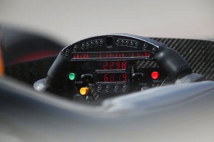
Champ Car Electronic Dashboard

As a wrap-up to the CIO Dashboard series, I’ve summarized some of the key points and added a few new ones to this list of 10 CIO Dashboard tips.  Thanks to two of my colleagues at Diamond, Jim Quick and Adrian Vern, who are experts in measuring and communicating IT value through dashboards and provided their ideas.

10 CIO Dashboard Tips

1.  Know the questions your dashboard is trying to answer before building it

A financial services company we worked with a few years ago asked for help to review their IT dashboard and help them figure out how to make it better - that said, they were pretty proud of it.  IT WAS A 20 PAGE POWERPOINT FILE!  The basic issue they had is that they were trying to answer every conceivable question someone might have.

2.  Make sure you can actually collect the data you want to measure

You can do some phenomenal business driven design for a dashboard, but if you don’t have the data, you are dead in the water.  An insurance client wanted to measure productivity on his dashboard but didn’t have reliable time tracking.  We had to come up with a proxy for productivity instead (using project budget, deliverables and milestones…).

3.  Know your audience and understand how they consume information

Resist the temptations (or encouragement from staff or vendors) to use a fancy graphical dashboard tool for your early dashboard efforts.  Bottom line is that busy executives and managers don’t have the time to browse your dashboard online.  Know your audience(s) and how they consume their information.  If they have a long Connecticut - NYC commute, maybe a podcast is the best way to deliver it!

4.  Begin by summarizing and analyzing data you already collect

The easiest place to start is reporting on data you already collect and trust.  Think about recent system or process that has been improved and its data scrutinized.

5.  Your first dashboard should never use a dashboard tool - that should come later

Focus your initial efforts on defining the questions, understanding the audience and determining the credible metrics to report.  You probably won’t get it right at first, so why waste the expense of a fancy tool until you learn more?

6.  Dashboards should always have a printable version

If you want to make decisions using your dashboard, it should be portable and available when and where you need it.  Once the dashboard is established, some consumers of the dashboard will hopefully start carrying it too. [if you deliver your dashboard on a mobile device, that will work too]

7.  Incorporate application instrumentation into systems design process

This tip is a little more involved, but can create a lot of options for you.  Basically, the idea is to create a standard way to collect business metrics and embed the collection into the related systems.  I have helped a few clients do this specifically for metrics that were used in their business cases - sort of an automatic reporting feature to track the actual value their systems are helping to deliver.

8.  Make sure those responsible for creating the dashboard understand who is reading it - it will increase quality

One of our insurance clients was having some data quality issues with an IT performance dashboard.  So, they decided to make a big deal of letting everyone know who (the COO, CFO and CIO) was reading the dashboard and that they were all pretty disappointed with the unreliable information.  This helped to improve the data almost overnight.

9.  Create a report to perform checks and balances on core dashboard data to increase credibility

Another idea for improving dashboard data quality is to build a companion report to perform some checks and balances to increase confidence.

10.  Keep a list that tracks the decisions and changes made as a result of dashboard analysis; attach quantitative and qualitative benefits that result

We all want to get value from our business investments.  So, why not track the decisions made using a dashboard and the outcomes/results from the decision?  See if this whole CIO Dashboard thing is worth it or not.

That’s it for the CIO Dashboard series.  I hope it made you think a little.  Please leave me some thoughts in the comments section.

Further Reading on Dashboards:

Share on LinkedIn3Tweet about this on TwitterShare on Google+0Share on Facebook0
  • Hi Chris,
    The metaphor of a vehicle dashboard is a good one. As every driver knows, such a dashboard displays data that has different levels of priority and importance. The feedback from different processes each requires an appropriate level of attention and speed of reaction.

    So… a driver will pay more attention to the tactile feedback obtained via the steering wheel, and the sound of the engine (or the rev counter), reacting quickly to the need to steer or change gear, than they will to the fuel gauge or odometer. They’d better!

    Similarly, some management measures warrant immediate reaction and a decision. The information provided by some others can be considered in a more leisurely fashion. Hence, a project reporting Status=RED should stimulate an immediate change of behaviour. Etc.

    Arguably, decisions should be made only on the basis of quantitative information… hard evidence. If people present opinions as the basis for decision-making, they should be sent off to gather more data, and to make a fact-based business case. They will need to be taught to do this.

    I suspect many folk will be surprised at the number of initiatives that will never see the light of day if such a rational approach is adopted. And that prevents waste, saves money, and makes for a more effective use of resources all round, critical in today’s financial climate.

    Best regards,
    Grant (PG) Rule
    MD, Software Measurement Services

  • Chris:
    I was going to leave a similar comment as Grant (PG) Rule did that the dashboard analogy is a good one. However, there are some problems to be overcome and one of the principle ones is the audience. In a 30+ year career, I’m not sure any of the other C-level executives I worked with would be interested in following the CIO’s dashboard, including the CEO. Therefore, I think the focus needs to be on information that the IT organization and especially the CIO is interested in following. When presented with interesting information, the CIO can always say I didn’t see that on the dashboard this morning and I should have. This will focus staff on building and using the dashboard.

    If the CIO approaches the dashboard as a demonstration project and builds it based upon the interests of his/her leadership team, it can become a foundation for the distribution of information that is otherwise disjointed and not effectively managed. As an example, I receive a report from a colleague as an attachment to an e-mail. The report is distributed on a periodic basis. I respond to the e-mail and tell them this information should be distributed through the dashboard and an alert posted when the report is updated. This puts the report in a single place which is available to all and as a plus reduces storage costs.

    As the value of the CIO’s dashboard evolves, the basic information management principles it represents can be demonstrated to other C-level executives and some may choose to create their own CFO, CMO, etc… dashboard. Eventually the CEO and COO might see the value of the concept and want to create a companywide dashboard.

    One final point, I agree that a dashboard tool should not drive the process of creating a dashboard, but a tool that makes it easy to collect, post, and alert people that the information is available should be considered. It should also be easy to upgrade the tool set as the use of the dashboard evolves. One measure of the success of the dashboard, over time, is that none of the information I receive comes to me through e-mails but is distributed and managed within my dashboard.

    Bill
    Asuret, Inc.

  • Pingback: 10 IT Metrics for a New CIO — CIO Dashboard()

  • Pingback: The CIO Guide to Dashboards — CIO Dashboard()